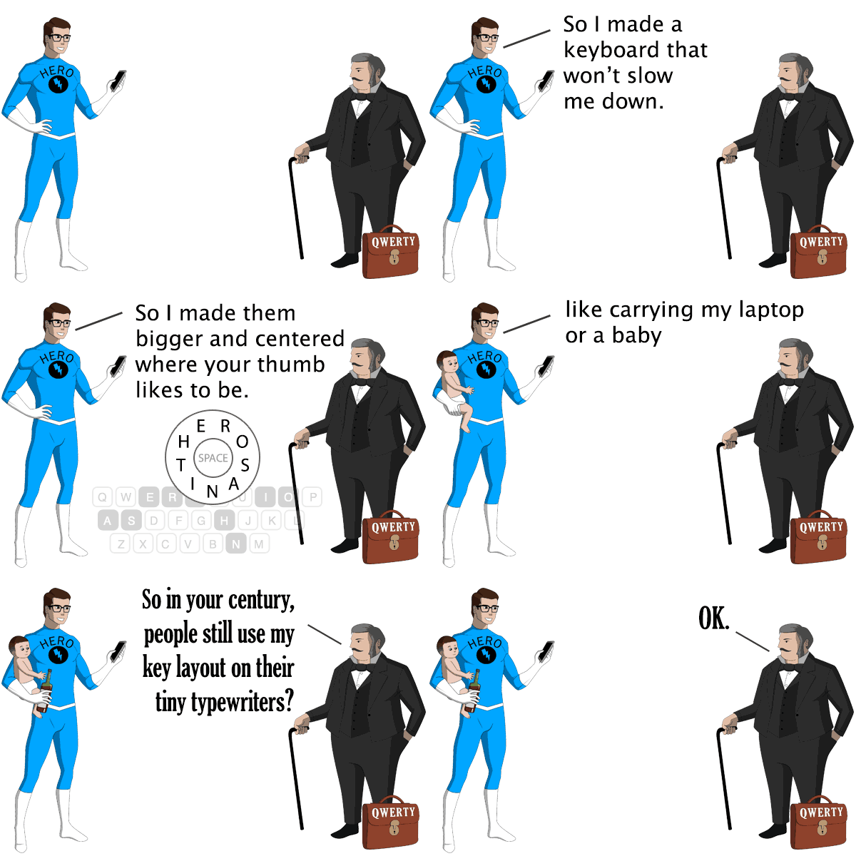
You'll feel comfortable using HERO after just a few days. So save your thumbs, and try the smarter cooler HERO Keyboard.
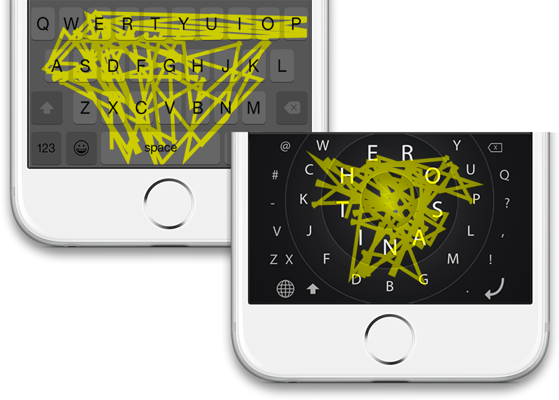
Finger path typing the same sentence on QWERTY and HERO.
It's true: if you type 140 characters on HERO's patented design, your fingers travel 3 feet (35%) less than on QWERTY.
HERO also puts the @, #, -, ?, !, comma and period on the main screen so you won't have to switch views as much.
Save your thumbs, my friends.
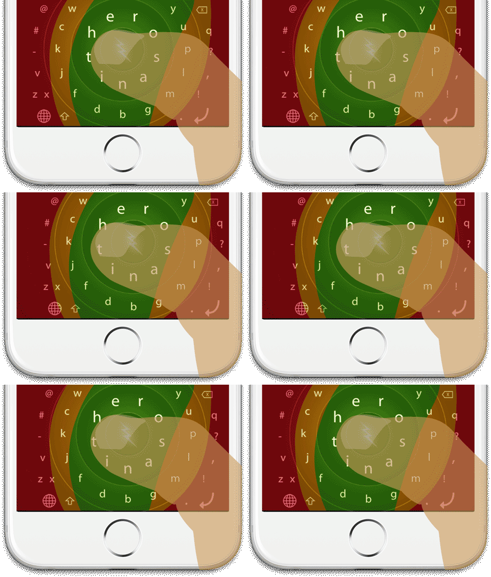
Colors show thumb-reach comfort zones.
Tilt your iPhone 6/7/8 or Plus, and HERO slides the keys within reach of your cute stubby thumb.
The most-used keys are about 35% bigger than on standard keyboards.
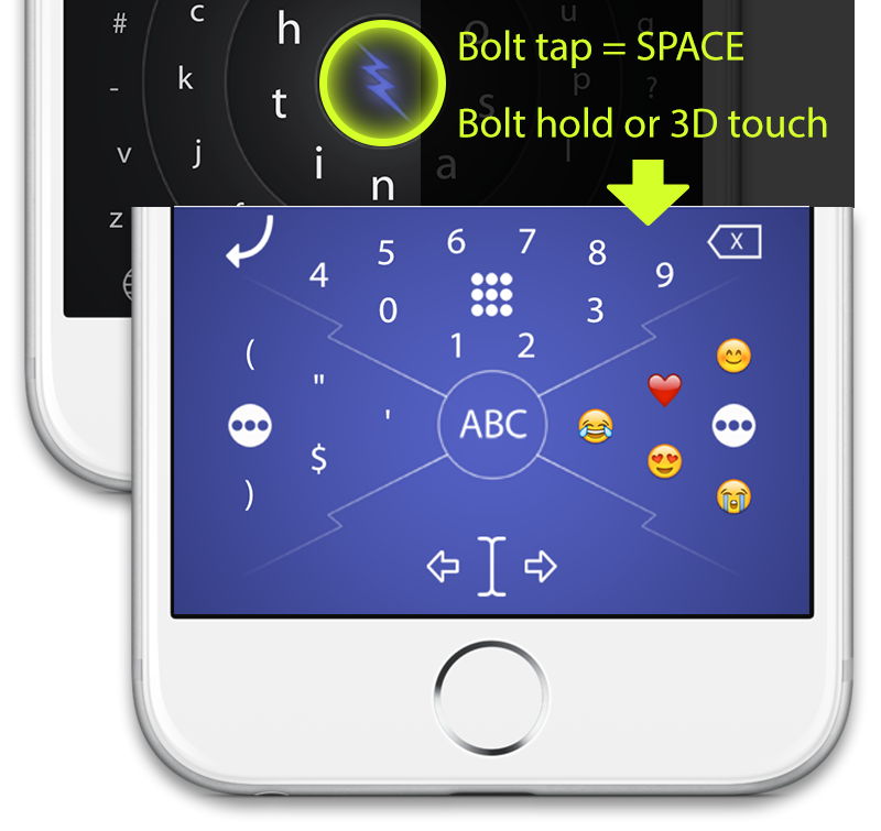
Tap HERO's revolutionary Bolt button to enter a SPACE, or double-tap it for period+SPACE.
Hold or 3D-touch the Bolt then drag for superfast access to numbers, cursor control, and your recent emojis and symbols.
It's your typing superpower, with more powers planned. (I'm thinking GIPHY support and text snippets. Got suggestions? Post 'em in the HERO Users Group.)
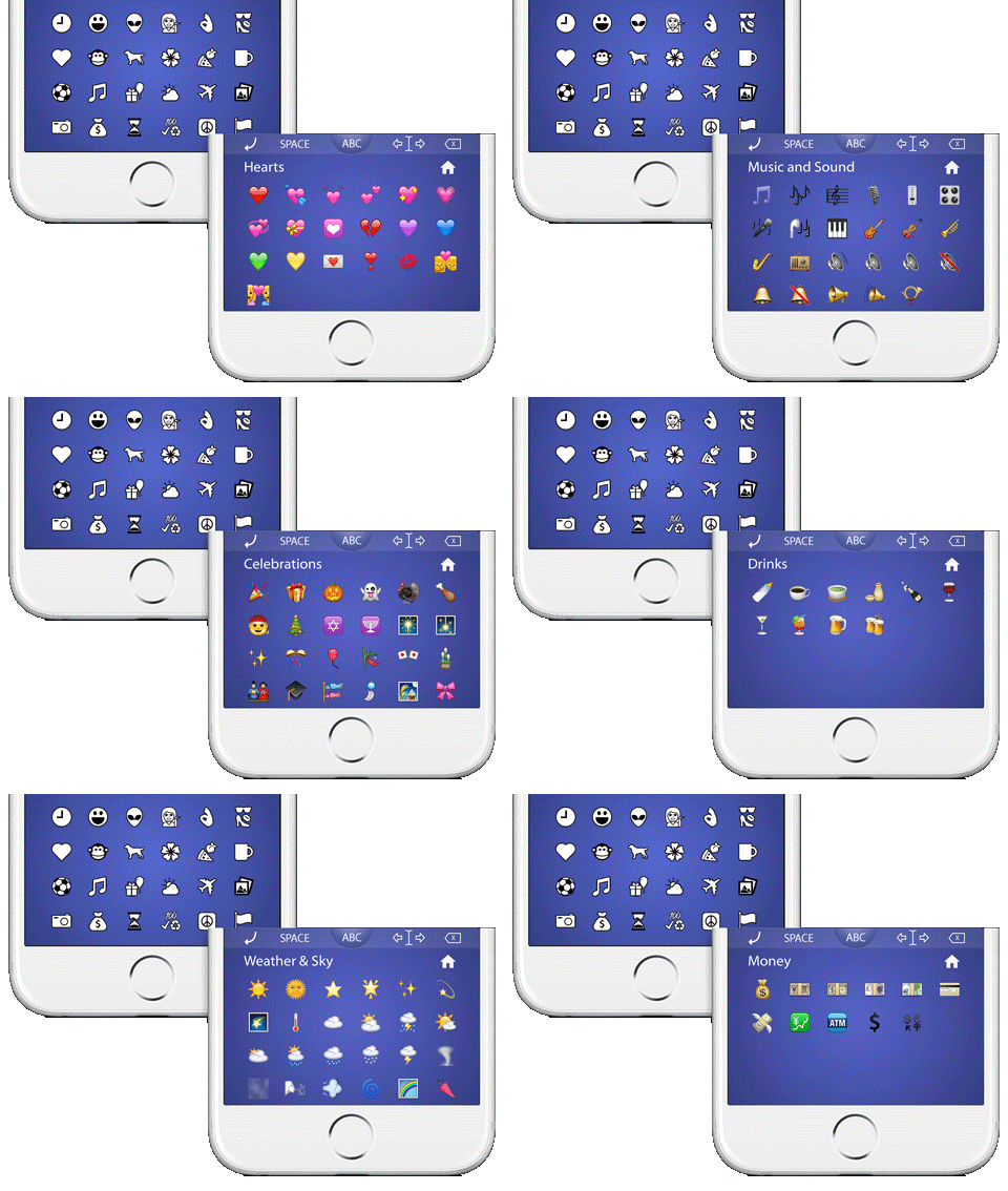
HERO's emojis are grouped based on real emoji usage analytics. Hearts, Music, and Money categories? Score.
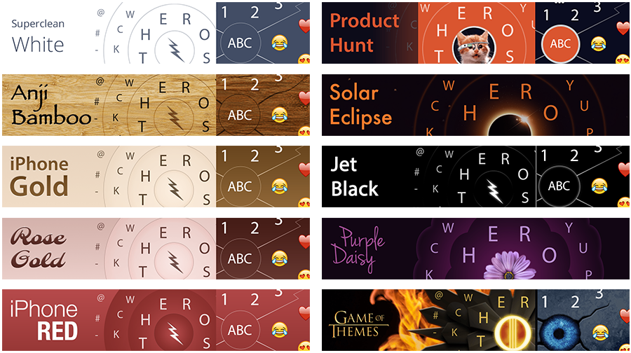
Boring blocky keys or gaudy colors? Clearly not heroic.
HERO comes with a variety of themes to choose from.
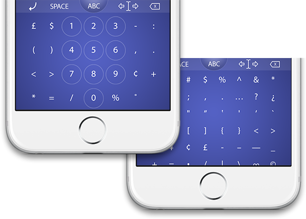
HERO's dialpad view gives faster number entry, surrounded by all the related characters you'll need.
The Symbol view has niceties like left and right-facing quotes, copyright, bullet, infinity, and more.
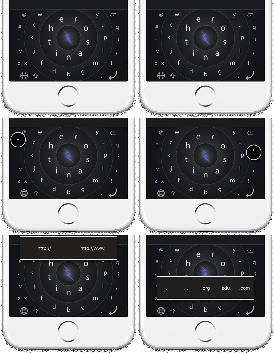
Need accented characters? Maybe an em-dash or .com? Hold or 3D-touch certain keys to reveal extended characters and other helpful tidbits.

Hello! I'm Corey Stone, full-time User Experience Designer by day, and founder/designer of HERO Keyboard by night. Here's the story of how HERO came to be...
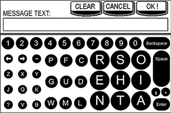
My concept from 2001 (pre-smartphone) for an embedded in-truck messaging system.
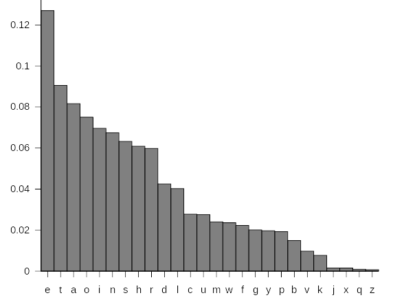
Letter frequency chart by Nandhp (public domain).
It was 2001 (remember pre-smartphone life? Bring your map!), and I was designing a small touchscreen keypad for an in-vechicle messaging system. I'd recently finished my Biomechanics/Ergonomics master's thesis measuring muscle activity on physical keyboards, and after double-checking the anthropometric charts for touch size standards, I realized the screen was too small to make all keys the recommended size.
Then I thought, "why should all the keys be the same size, when we use E waaaay more often than Z, for example?" So I looked up letter frequencies and found that in English, we use just 9 keys about 80% of the time. Since different-sized keys can't be arranged into a grid very well, I figured I might as well put the most-used keys together, and put the most common letter combinations ("bigrams," like TH and ER) next to each other.
I was pretty proud of my solution, but when I presented it to the engineering manager, he was like "WTF?" and implemented a simple QWERTY grid. Sigh. But the seed was planted.
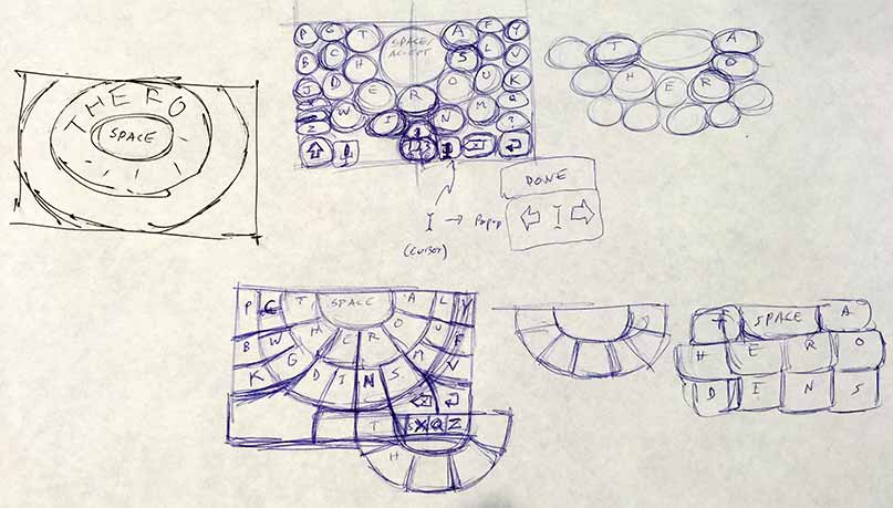
Early sketch concepts for what would eventually become HERO.
Several years and four kids later, I found myself doing a lot of one-thumb baby-holding typing and thought "there must be a better way" (to type, not parent). The old QWERTY layout might work well enough for 10-finger typing (and we've built up a lot of muscle memory for it), but it just doesn't make sense for the less-ingrained one or two-finger mobile typing.
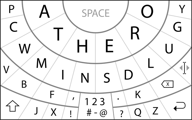
An early version of HERO, which I was calling the "Thumbprint Keyboard" at the time.
I sat on the idea for awhile, as I too often do, but when Apple finally announced support for 3rd-party keyboards, I knew I had to do it — I had to try to make mobile typing better for myself and everyone else.
So while my wife baked in the sun on our kid-free vacation, I sat in the nearby shade designing HERO (which I was calling the Thumbprint keyboard for awhile, because early versions had more of a thumbprint pattern instead of HERO's circular rings).
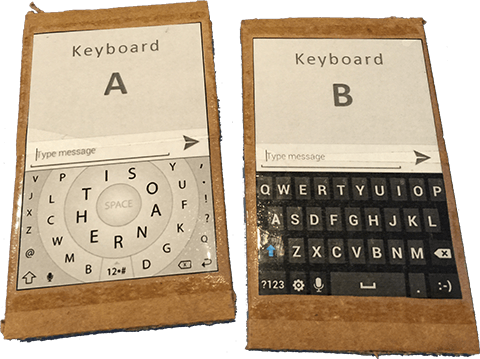
Cardboard phones for early A-B keyboard speed tests.
The original HERO v1.0 video.
Once design was done and tested, it was time to get the app built. I'm a designer not a programmer, so I had to pay a contract developer to build it. The first developer for HERO 1.0 failed, then the second one did a pretty good job given my budget. In general, lots of people were interested in the design, but the implementation just wasn't where it needed to be, which brings us to today.
HERO v2.0 was recoded from scratch by an experienced keyboard developer. It's still not as full-featured as I'd like, but hopefully it will fund future development (or I'll find a deveroper-partner!) so HERO can become the kick-ass keyboard we all deserve. And I want you to join that journey not just as a customer, but as a partner to help guide development by giving me input at the HERO Users Group.